I was reading a post on O'Reilly Radar about Google's effort to cover Mountain View with free wifi. They linked to a chart on NTIA's website that shows the frequency allocation in the United States. It brought back fond memories. One of my favorite university professors had the same chart hanging in his lab. Maybe I'll print (or plot) it out to recreate that college atmosphere in my cubicle.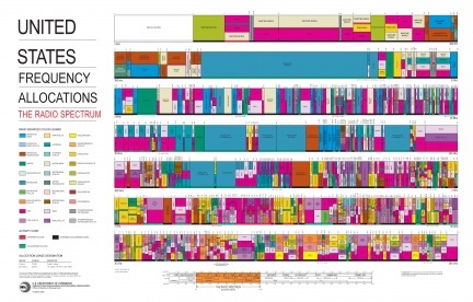
Tuesday, February 20, 2007
US frequency allocation chart
![]()
Subscribe to:
Post Comments (Atom)


2 comments:
Pretty cool chart
Josh also mentioned this site where you can receive a free US frequency allocation poster by mail.
Post a Comment